

Matt Pullon – a graphic designer and member of St Stephen’s – has dedicated his time, effort and considerable skills over the last few months to design a brand new logo for the church!
It’s a refreshing and impactful image and it carries a lot of meaning.
As well as the logo, Matt created a whole scheme of design elements, fonts, icons and colours for us to use across all our platforms.


A great deal of thought and consideration went into his process. Here’s what he had to say!
Matt, can you talk us through the elements in the new logo?
The elements were actually religious symbols carried over from the previous versions of the logo. The three crosses represent the crucifixion, with the central more elevated cross that of Christ, crowned by a halo of light. The rocks at the bottom are symbols commonly associated with St Stephen. In continuation of the previous logo, the three crosses also double up as three swords, which are a historic symbol of Kirkstall, where the church is home.
The halo features subtle crenellations or notches. While these often represent sun rays in medieval art, here they also symbolise cogs and machinery, honouring Kirkstall’s rich industrial past, and were inspired by the original and still operational clock mechanism in the church clock tower, which I got to wind by hand!
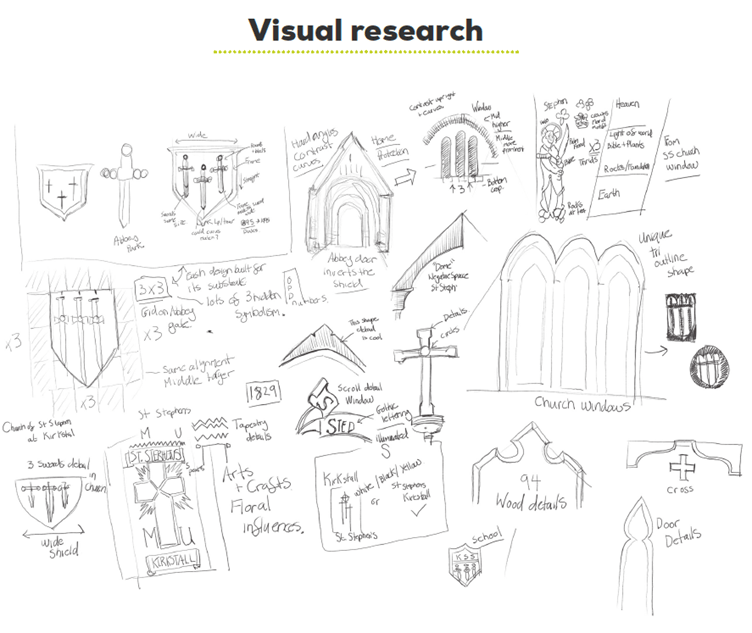
Did you do any research before starting the design?
I spent quite a while looking around the church and taking lots of photos and doing quick sketches. There are some amazing pieces of artwork and craftsmanship dotted all around the building, from the exposed wooden beams to the beautiful stained glass windows and many unique textiles, all of which speak proudly with voices from the past. Speaking to members of the congregation was also really important. I did my best to capture all of that in my research.
I live locally, so I spent time researching at Kirkstall Abbey, just a short walk from St Stephen’s, where there are loads of inspiring pieces of metalwork as well as the ruins themselves. And I started to notice correlations between compositions that spanned hundreds of years of history. It’s amazing what’s there right on our doorstep. We do live in an increasingly digital age, so it was also really important to bring that history forward into the modern world, fit for the future, so I balanced this with a lot of trend-forward research into digital platforms and contemporary logo design best practice.

How long have you been a member of St Stephen’s church?
I’ve been coming to St Stephen’s Church for just under a year and I love it. It’s my first time back in a church since I was a child and I am so glad that this is now part of my life. I encourage anyone with any curiosity to just come along. Everyone is welcome and you couldn’t meet a nicer group of people. It’s a really open-minded and safe space with a really diverse and friendly atmosphere.
“I encourage anyone with any curiosity to just come along…It’s a really open-minded and safe space with a really diverse and friendly atmosphere.”
What is your background in digital design?
I have a degree in illustration and a PGCE in art and design. I studied at the University of Westminster and The Institute of Education, London. I’ve been a professional designer in both print and digital mediums for around 20 years and have worked across many sectors, starting my career in studios in London and now working as an internal graphic designer for a not-for-profit organisation in Leeds.
If you’re interested in knowing more, check out Matt’s Instagram page!
